Personally, I’m a big romantasy fan. I’m a big reader in general, but romantasy is one of my favorite forms of escapism. The color palette for your author branding and website should reflect the rich tones of the worlds you create. When readers land on your author website, your visual branding can help set the stage for their interactions with you and your work.
The right color palette can make your website feel enchanted, mysterious, romantic, scholarly, dramatic, or otherworldly—all qualities that can help communicate the atmosphere of your books and create a memorable author brand. And we really want them to remember you!
Whether your stories feature forbidden magic, ancient kingdoms, witchy heroines, gothic castles, or modern-day Greek gods, there’s a romantasy color palette to complement your world.
Here are five color palette ideas for romantasy authors, along with some complementary brand ideeas to help you bring each aesthetic to life.
COLORS
#0a0a04
#4d0a09
#8c3a24
#c94c2f
#aea18e
#eadbc7
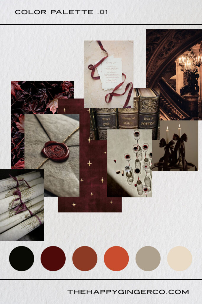
Think candlelit libraries, ancient manuscripts, secret societies, forbidden knowledge, and romance that unfolds somewhere between the stacks of a centuries-old university.
A Dark Academia color palette is perfect for romantasy authors whose stories have an intellectual, mysterious, or scholarly atmosphere. Deep reds and maroons bring in the romance and drama, while warm creams, parchment tones, charcoal, and near-black neutrals keep the palette grounded.
The darker and lighter ends of the palette will be the ones you use most, with that bright red used to add a powerful spark.
Best for: romantasy featuring academia, magical universities, secret societies, mages, scribes and magical knowledge, libraries, court intrigue, and morally complicated characters.
Brand personality: intelligent, romantic, mysterious, sophisticated, scholarly
Works beautifully with: vintage book photography, handwritten annotations, antique illustrations, candlelight photography, parchment textures, ornate borders, and subtle paper grain
COLORS
#0b0c0a
#202b12
#984a1c
#b17d55
#d5baa5
#f4ede7
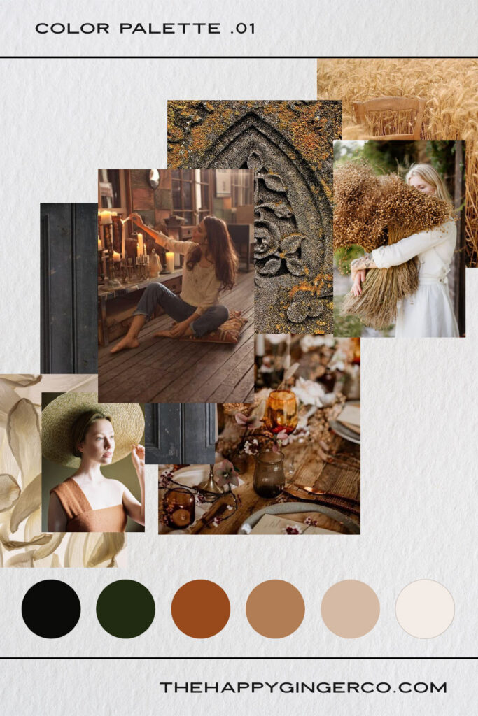
For the author whose books smell like autumn leaves, simmering potions, old spellbooks, and something delicious baking in the oven.
A Witchy Fiction palette leans into warm autumnal colors. Think burnt orange, terracotta, mustard, mossy green, warm brown, and creamy ivory. Unlike a darker gothic palette, this aesthetic can feel inviting and magical rather than ominous.
It’s especially effective for authors writing cozy witchy romantasy, contemporary magic, enchanted small towns, covens, magical shops, and stories where romance and magic feel wonderfully intertwined.
Use the warm neutrals as your foundation, then let the congac, rust, and dark green create moments of visual interest throughout the site.
Best for: witchy romantasy, cozy magic, modern witches, covens, historical witch fiction, enchanted shops, autumnal settings, magical villages, and stories with a warm, whimsical atmosphere.
Brand personality: magical, warm, earthy, whimsical, inviting
Works beautifully with: botanical illustrations, dried flowers, potion bottles, moon imagery, autumn photography, handwritten details, wood textures, and vintage apothecary-inspired graphics
COLORS
#551223
#eac5d6
#dc7b5a
#e38b97
#ebd2ce
#fdf3f4
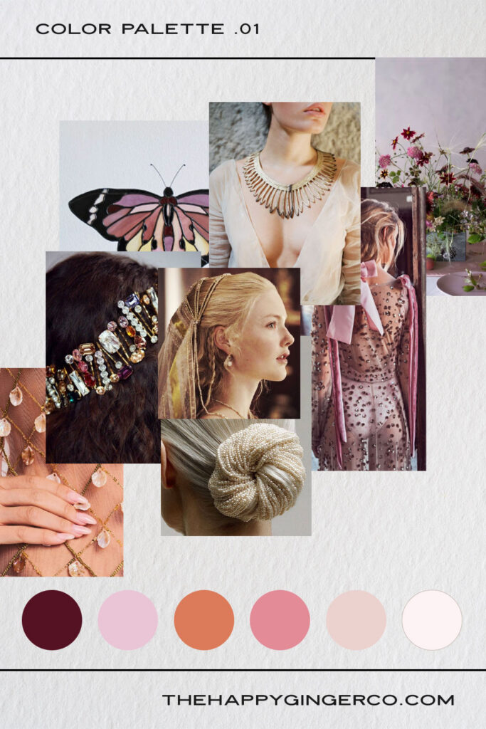
When the Greek pantheon walks and dates among us mere mortals, colors feel a little brighter and things get a little dangerous.
This Modern Day Myths palette is for romantasy that feels bold, contemporary, and larger than life. Bright pinks and oranges bring plenty of energy and personality, while dark charcoal and soft neutrals keep the stakes high.
Think modern goddesses, immortal beings in designer clothes, divine romances, magical realism, neon city lights, and ancient legends reimagined for a contemporary audience.
The trick with this palette is balance. Let the bright colors act most often as accents rather than using them everywhere. A mostly neutral website with strategic canvases of pink or orange can feel modern and editorial.
Best for: contemporary romantasy, mythology retellings, modern gods and goddesses, urban fantasy romance, magical realism, and stories that put ancient legends into a modern setting.
Brand personality: bold, modern, playful, confident, magnetic
Works beautifully with: editorial photography, dramatic portraits, fashion and modern art, marble textures, architectural photography, graphic shapes, and subtle metallic accents
COLORS
#212838
#423d43
#766666
#aa9898
#d4c1ba
#e8d7cf
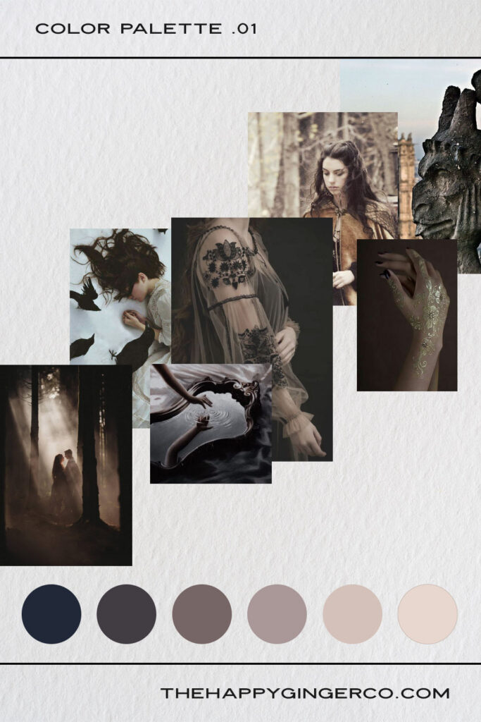
Romantic, dramatic, atmospheric—and surprisingly versatile.
A Gothic Romance palette doesn’t have to rely on black, red, and purple. Instead, try building an entire brand from warm grey neutrals, ranging from nearly black charcoal to soft stone and creamy greige.
The result is elegant and moody without feeling overly themed. It gives you the atmosphere of a gothic novel while leaving plenty of room for beautiful photography, dramatic typography, and rich visual textures.
Because the palette is intentionally restrained, typography and imagery can do much of the storytelling. Large serif headlines, dramatic photography, and generous negative space can make this aesthetic feel luxurious and cinematic.
Best for: gothic romantasy, haunted castles, forbidden love, vampires, ghosts, dark fairy tales, brooding heroes, and stories filled with atmosphere and longing.
Brand personality: romantic, dramatic, elegant, mysterious, timeless
Works beautifully with: black-and-white photography, moody portraits, architecture, old estates, stone textures, antique frames, film photography, and delicate floral imagery
COLORS
#0a2d33
#2c504c
#980204
#a44936
#e1b1ab
#f8f2e9
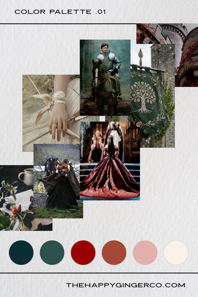
For sprawling kingdoms, powerful magic, ancient prophecies, enchanted forests, dragons, legendary heroes, and romances that could change the fate of an entire realm.
A High Fantasy palette is the most jewel-toned of the five. Rich reds, blues, and greens give the brand a sense of magic and grandeur, while warm neutrals prevent the colors from competing with one another.
Instead of using every jewel tone at the same intensity, choose one dominant color and use the others as supporting accents. This creates a sophisticated fantasy aesthetic.
Keep your backgrounds either cream or deep blue, then the jewel tones can be reserved for buttons, links, headings, decorative elements, and other moments where you want the magic to stand out.
Best for: epic romantasy, fae courts, enchanted kingdoms, dragons, magical quests, royal romance, ancient prophecies, and sweeping fantasy worlds.
Brand personality: epic, luxurious, adventurous, magical, regal
Works beautifully with: fantasy landscapes, maps, illuminated-manuscript details, botanical illustrations, celestial imagery, ornate gold accents, velvet textures, and atmospheric character photography
Your author website doesn’t need to look exactly like the cover of your latest book. In fact, your website should be a little more flexible. We want it to be a home for your body of work, not just your latest release. That’s why it’s important to pick a color palette that encompasses who you are as an author.
A great way to approach this is to think about the emotional experience you want readers to have when they encounter your brand. A website is a form of hospitality, so how do you want your guests to feel when they walk into your digital home?
Do you want them to feel like they’ve stepped into an ancient library? Choose Dark Academia. Want your website to feel like a magical autumn afternoon? Witchy Fiction might be the perfect fit. If your romantasy is bold, contemporary, and inspired by mythology, try Modern-Day Myths. For something elegant, atmospheric, and deeply romantic, Gothic Romance offers a beautifully restrained direction. And if your stories span kingdoms, magical realms, and epic adventures, jewel-toned High Fantasy can help communicate that sense of scale.
The most important thing is consistency. Once you’ve chosen your palette, carry those colors through your website, newsletter graphics, social media templates, reader magnets, and other author-brand materials. A cohesive visual identity makes your author business feel polished and recognizable—and gives readers another way to connect with the world you’ve created. Welcome them in.
Sign up below to get a collection of 25 font combinations AND 25 color palettes that will help you elevate your DIY Brand Design. Whether you're just getting started, need to watch your budget, or love the feeling of being your own designer, you can choose from these designer-curated fonts and color palettes to brand your business with confidence.
clients
featured in
clients featured in
from one wild heart to another
Having been a visual designer for over 10 years, I know that every part of a brand (even the parts that are often unseen) deserve to be expressed with honesty, beauty, and joy.
I am happiest standing behind the scenes, creating every design and detail for focused and intentional business owners. When I’m not designing website templates, brands or illustrations, I’m getting my glitter shoes metaphorically muddy with my own artistic pursuits.
Lifestyle
entrepreneurship
marketing
No paywall, no vague notions - just practical ideas and advice for your creative small business.
I'm sharing what I know in the clearest ways I know how. Because I genuinely believe the world is a better place with more creative businesses.
and get a coupon for 25% off my shop!
Sign up for my newsletter and get a direct link to business ideas and tips for your small creative business.
Proud to be selected as a Showit Design Partner.